Multi Timeframes trade example
In this article, we will go through several intra-day trades on Hang Seng, where we can effectively implement our multi-timeframe analysis. Analysing different timeframes helps keep you on the right side of the market and time your entries to catch excellent moves.
Although our examples are on an intra-day time frame, you can apply the same methodology to longer time frames that better suit your personal trading style.
Let’s look at some tips and tricks that you can use practically in your trading.
What timeframes do we use?
To prepare for the trading day and get the bigger picture of the market we use the thirty minute timeframe. During this preparation, we define the key levels and where the buying or selling pressure might be. Our two main timeframes while trading are the five-minute and one-minute charts.
Five-minute charts help us to get on the right side of the market and catch more significant moves.
We use a one-minute timeframe to manage trade execution, where we look at specific candles’ lows or highs and zones for possible entries.
Trade examples
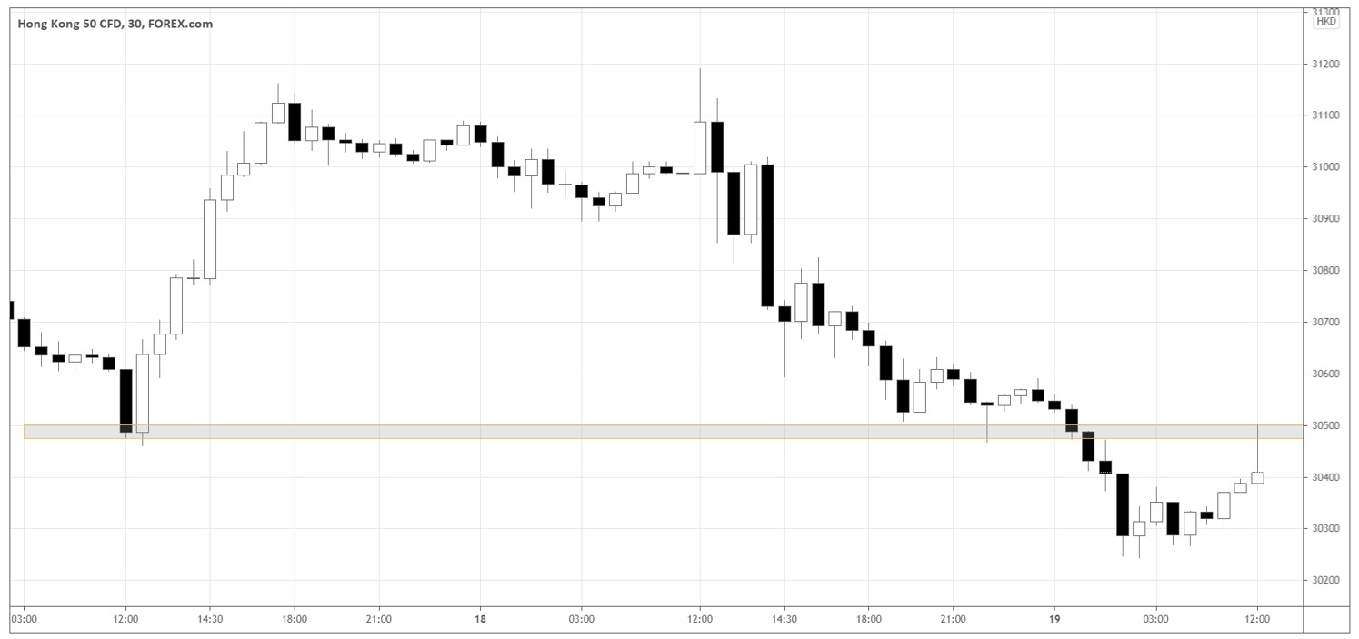
We will start by analysing the thirty minute chart on the Hang Seng Index to understand the big picture of the market. Let’s look at the chart below.

The key takeaways from the thirty minute timeframe are the following:
- Since yesterday, the market has been in a downtrend.
- The key price level is around 30500 (see the grey area). The market tested the level several times as a support zone until the breakout occurred, and the support then turned into a potential resistance level.
- In the first thirty minutes of the trading session (the main session opens at 12:30), the market formed a “shooting star” candle, which is bearish. The candle appeared near the key price level 30500, showing that the market bounced off the level, thus respecting it.
Given the points above, judging from the higher timeframe’s price action, we want to look for short-sell setups below 30500 and be very careful about shorts above 30500 or even consider longs.
Getting down to the lower timeframes
Let’s look at the three short-sell trades. We use two Exponential Moving Average (EMA) indicators of 20 and 50 periods to define the bias for a given day. MACD (10, 20, 9) and Stochastic (11, 3, 3) help us confirm the momentum.
Setup #1
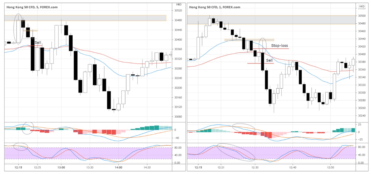
In our example below, we have both the one minute and five minute charts. EMAs on the five-minute chart showed us that the bias was down most of the day as EMA (20) was below EMA (50). Therefore, on the one-minute chart, we look for setups in the five-minute chart’s trend direction.

The market opened with a white candle (see the circled candle on the 5-minute chart) but got overpowered by the selling pressure, forming two black “inside” candles with the smaller bodies afterwards.
The price action tells us that many buyers at the opening turned out to be wrong. Thus, they are suffering losses as the market going against them. At some point, some of the buyers that got trapped on the wrong side of the market will start selling to limit their losses. So we are now looking for a short entry on the one minute chart.
The ultimate trigger to go short is the upward wick’s appearance (see the circled wick on the 1-minute chart). The wick signals the last unsuccessful attempts of buyers to push the price higher.
The fact that it was happening just several minutes after the index opening adds to the wick’s credibility. We can expect a higher volume of decisive transactions that can move the price.
Notice that the wick tested the black candle’s low on the five-minute timeframe. On the one-minute chart, we can see that the market has been interacting with the same price area (see the grey area around 30440) from the beginning of the trading session, forming the ultra-short-term resistance, which gives us additional evidence of the selling pressure.
The sellers absorbed the impulse upward, and the market quickly retraced down. We sell at the breakout of the last black candle’s low on the one-minute timeframe. The “sell” red horizontal line represents the exact entry price.
The momentum indicators confirm the downward pressure as MACD and Stochastic decline before the entry. Check the circled areas in the indicator windows of the indicators in the chart above.
The stop-loss deserves special attention here. The first that comes to mind is to hide the stop above the wick or even above the newly formed short-term resistance. However, in that case, the stop would be quite wide, hurting our risk-to-reward ratio.
In this trade case, we used a shorter stop-loss of 40 points that we hid above another micro resistance level. The low of the five-minute candle forms the micro resistance. On the one-minute chart, you can see that after the market pushed down through this price (30404), the white candle couldn’t exceed the price, signalling that the market participants are interested in selling at this price.
We take profits when the down-impulse finishes as the first white one-minute candle appear, or we can close the position using the take-profit pending order.
Look out for warnings!
The price first tested 30250, and then we saw a subsequent retracement up-move that then fell back to the new low. We could consider going short at this point if the market breaks through 30250. However, instead of rushing into another short, we waited for the price action to confirm an entry. The more we saw, the less we wanted to be short again even if the market fell below 30250.

Before the market rebounded up from the newly formed local support at 30250, it gave a warning against further shorts – the price was forming a consolidation zone with the lows consistently above 30250 as seen on the one-minute chart above.
The consolidation was signalling that more buyers were interested in getting in at these prices.
Such behaviour makes the 30250-30275 local support even more significant. Keep that in mind as we move on to our next viable setup.
Why not go long?
Not long after our first setup, the market retested the 30250-support area and retraced back to the 30400 price level. We have already identified this as a key price zone.
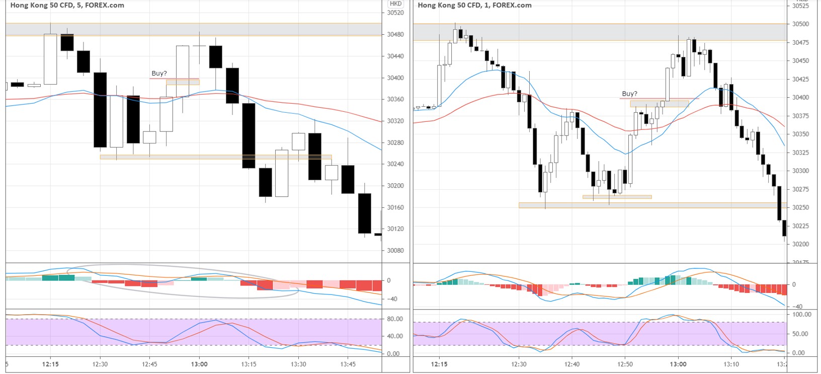
Before a swift impulse through 30400, the market was ranging for five minutes just below this key zone, Such consolidation might also be considered a long entry opportunity. Look how the price action uncovers in the chart below.

However, if we look at the five-minute timeframe, the general momentum is downward, as we can see from MACD (see the circled area).
Another factor that is playing against the long setup is the big picture of the thirty minutes timeframe. Do you remember the 30475-30500 support-turned-resistance area? If we buy against this resistance, there is not much of a move potential to justify the risk.
It would always be a great idea to double-check how your setups are aligned with the higher timeframe.
Setup #2
As the price rebounded up from 30250 support and approached the 30475-30500 resistance, we want to use the five-minute chart to look for a turning point to fade this up-move.
The market offered the first price action signal by forming a Doji candle near the resistance.
The people that bought around 30250 would be alerted by such price behaviour, and some would decide to take profits by covering their long positions, thus selling.
EMAs can also help us to identify the entry point. When EMA (20) goes above EMA (50) on the one-minute chart and starts to show the signs of weakness, we consider short trades on the five-minute timeframe. As you see, the signs of weakness coincided with the breaking of Doji’s low on the five-minute timeframe (see the illustration below).

Further selling pressure broke the Doji’s low and formed a “Shoulder” pattern afterwards (see the blue arrow in the chart above). That’s all we need for the short-sell entry.
We sell when the market breaks the shoulder’s low. Our Stop-loss is above the shoulder’s high.
The objective exit area would be beside already familiar the 30250-30275 support.
Setup #3
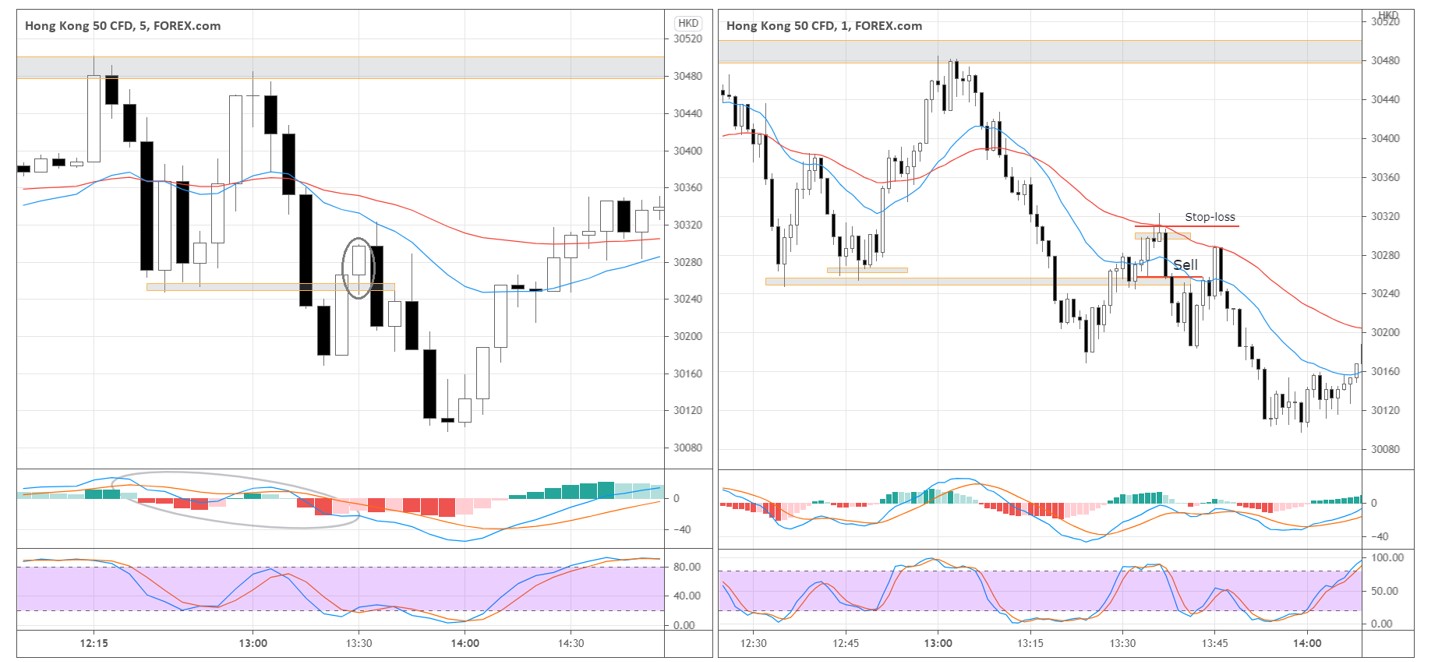
The final setup could test our patience in a way. On the five-minute timeframe, we have a bearish environment: EMAs are heading down, and MACD is declining to show bearish momentum. The focus was on the second white candle that pushed above 30250 (see the circled candle on the five-minute chart).
Once the next five-minute candle exceeded the previous candle’s high and quickly dropped to the 30250, forming a big black candle on the one-minute timeframe, we sell with a stop-loss above the black candle’s high or the swing’s high (see the chart below).

If the market loses steam to move higher away from the support but instead attacks the former support, we get another sign of the weakness that stacks more odds favouring a short-sell trade.
Traders that bought above 30250 support now suffer losses as the market tanks below the support. As buyers cover their positions, it adds more fuel to the proceeding down move.
Depending on your trade management, you might have withstood the subsequent deep pullback from 30180 to 30280 without being shaken out of the position. In the case of our specific execution, the position was covered with the first signs of the upcoming pullback as the market was testing the previous low around 30180, grabbing a small profit.
The approaching end of the session played a role in our more risk-aversive style of exit on this trade. We took the exit on the first sign of weakness in the down move to reduce our risk at the end of the day. However, if we had held through the pull back and respected the opening stop loss, further gains would have been made.
Conclusion
We looked in detail at the trading session in Hang Seng. Understanding the big picture and following the market momentum on the five-minute timeframe are the keys to staying on the right side of the market and pinpointing the exact entries on the one-minute timeframe. Technical indicators help confirm the momentum direction, and the price action enables us to identify entry points and limit the risks.
A key to selecting successful entries is in your market preparation and identification of key price zones. And using these key price zones on the lower time frames to assist in your price analysis.


