In this article, we will learn how to identify when the market is stretched into a key level and how to take advantage of this environment by trading the reversal off that key level. This is a strategy suited to the more experienced trader.
The setup is one of the key concepts we use to trade rebounds. Here we will look at two FX examples in AUDUSD and GBPUSD. Although the concept and the price action behind it works in many other markets such as cryptocurrencies and bitcoin in particular.
Key price level
The first part of the “stretched market” setup is a key price level. The market needs to test the level at least twice.
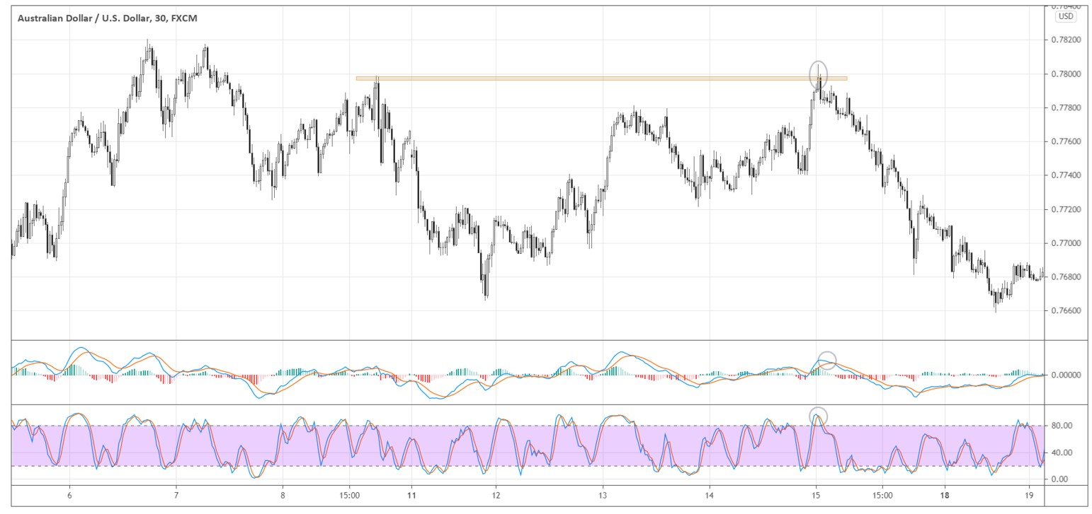
In the thirty-minute AUDUSD chart below, we see the 0.7800 price level that the market tested twice within several days. Pay attention to how the market approached the price level the second time.

We need to see a specific way of how the market gets closer to the key price level. The move must be “stretched” or steep compared to the recent price action, without many pullbacks on its way.
In the example above, within a couple of hours market approached 0.7800 with long white candles. Buyers were rushing to open their long positions until the congestion of sell orders around 0.7800 absorbed all the demand.
Patient traders who wanted to buy using limit orders probably didn’t get many chances to get filled. If there were no pullbacks, we could assume that there were not many buyers who wanted to close their positions and give chances to patient traders to get in.
What happens when new buyers suddenly cannot push the price higher anymore? People that bought, say around 0.7740, now see a profit on their long positions. Some of them would want to cash in and sell as they are aware that the area around 0.78000 may contain a lot of other competing sellers.
As the price starts curving down under the pressure of sell orders, those that bought just near the resistance would see losses on their positions and would want to get out, adding to the selling pressure.
The bottom line is that those that rushed to buy on the way up would most likely rush to sell on the way down. That’s why steep moves into a price level are often not sustainable, and we can take advantage of it.
Flush it out!
The second part of the setup is the “flush out” price action. The market pierces through the level and sharply rebounds back. In the AUDUSD example above, the market flushed out the 0.7800 level and finished below by forming subsequent candles below the level right after the level is briefly violated.
Such price action forms when there is aggressive selling going on for one reason or another. Seeing this, we can conclude that there is a real interest in selling at this level. The “flush out” increases the odds that the previous up-move will reverse.
Shoulder as an entry trigger
After the market flushed out the key price level and holds below it, we need specific price action to time our entry off the key level. We use the shoulder pattern to get in.
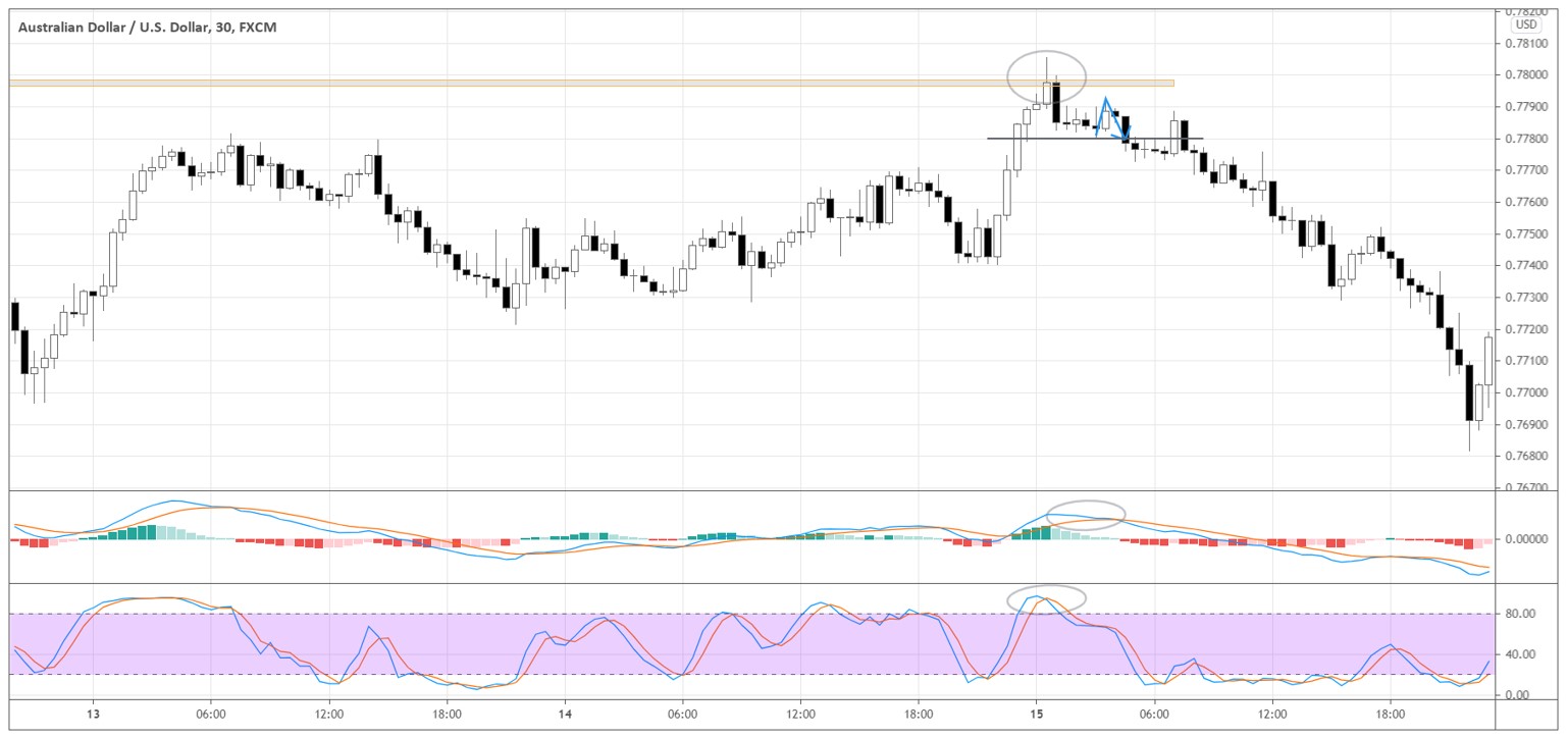
In the AUDUSD example below, the shoulder is marked with the blue arrow. We sell when the down-boundary of the shoulder is broken.

The market formed a little support around 0.7780, the breakout of which coincides with our shoulder-based entry. When the market makes such consolidations around the specific price, it’s easier to identify the shoulder, so the entry is more obvious.
Sometimes it’s difficult to identify the shoulder on the main timeframe, so we may need to go to a lower timeframe to find the shoulder.
To learn more about Shoulder entries see our video on How to Anticipate a Market Change.
Stochastic and MACD confirmations
The final step is to confirm the exhaustion of the momentum. We use Stochastic and MACD to gauge the momentum change. In the chart above, both indicators show the turning point in momentum. Look at the circled areas in the indicators’ windows.
Stochastic was rising to the “overbought” condition without any pullbacks. Although the market can stay in “overbought” while continuing the surge for a long time, the indicator merely shows the intensity of the price movement relative to the recent price action. In a proper context, indicators can support our analysis that the chance of the reversal is high.
MACD has also been decreasing since the market flushed out the key level and consolidated below it, forming the shoulder pattern. By the time the shoulder was formed, we could see a confirmation of fading momentum in MACD.
For more information on using indicators to support your price analysis – see our three part series “My Favourite Indicators”.
Stretched market example in GBPUSD
Let’s look at another example of the stretched market setup. Below is the thirty-minute chart of GBPUSD. The market formed the key price level 1.3700 by testing it several times on the 13th and the 15th.

On the 15th, the market made a powerful move towards 1.3700 without any meaningful pullbacks. The price level got flushed out as the market formed a long wick above 1.3700 and sharply pushed back below the level, consolidating under it afterwards.
Stochastic soared into the overbought area and started to reverse, confirming the “stretched” state of the market. MACD was also rising, and after the flush out, it started to decline, indicating fading momentum.
We sell when the market forms a shoulder (see the blue arrow right below 1.3700) and breaks below its down boundary around 1.3680. The market formed at least two shoulders while consolidating below the key price level, giving us more opportunities to enter.


